Behind The Design
THE CHALLENGE
Browsing cruises on NCL.com meant endless scrolling through a dense list of results, each row packed with information that was difficult to consume at a glance. Guests had to work too hard to compare itineraries, and the experience slowed down a decision that should feel exciting.
THE APPROACH
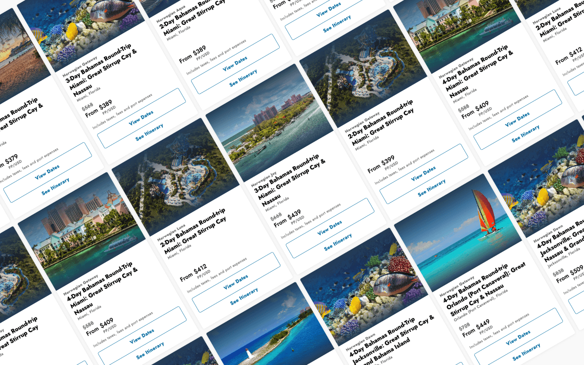
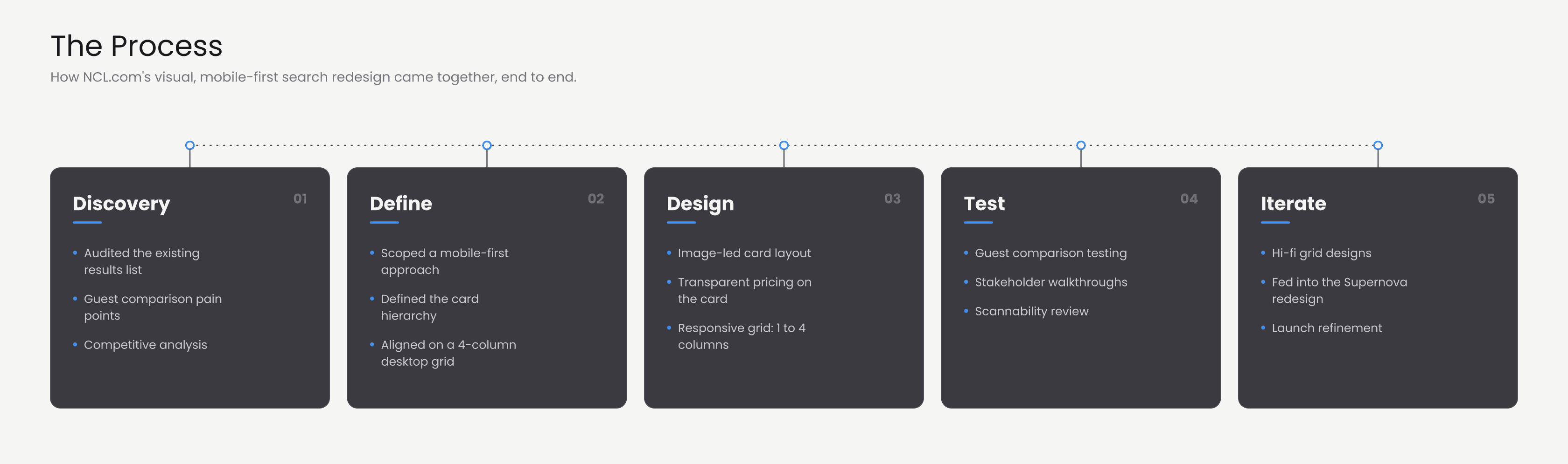
The solution started mobile-first — designing for the smallest screen forced better decisions about hierarchy and density. An image-led card layout puts destination photography front and center, with ship name, itinerary, departure port, and transparent pricing below. On desktop, a 4-column grid surfaces more results above the fold without sacrificing scannability. The card design influenced the direction of the Supernova redesign and shipped as part of it.


The Design
See also
Nora AI
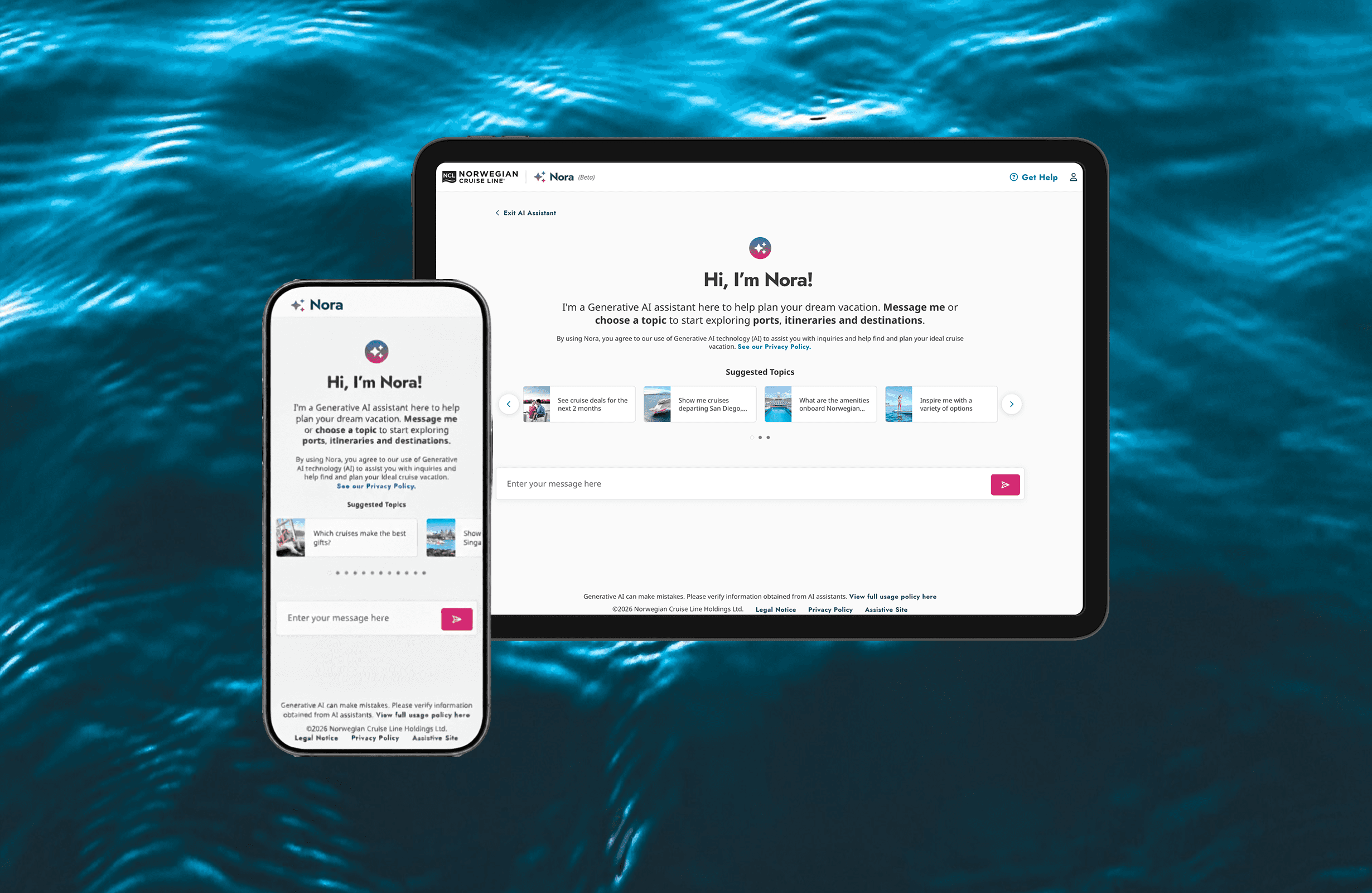
Expanded Nora from a discovery chatbot to a personalized guest services platform. 94.5% positive sentiment. 58% funnel lift.
NCL : Checkout & Payment
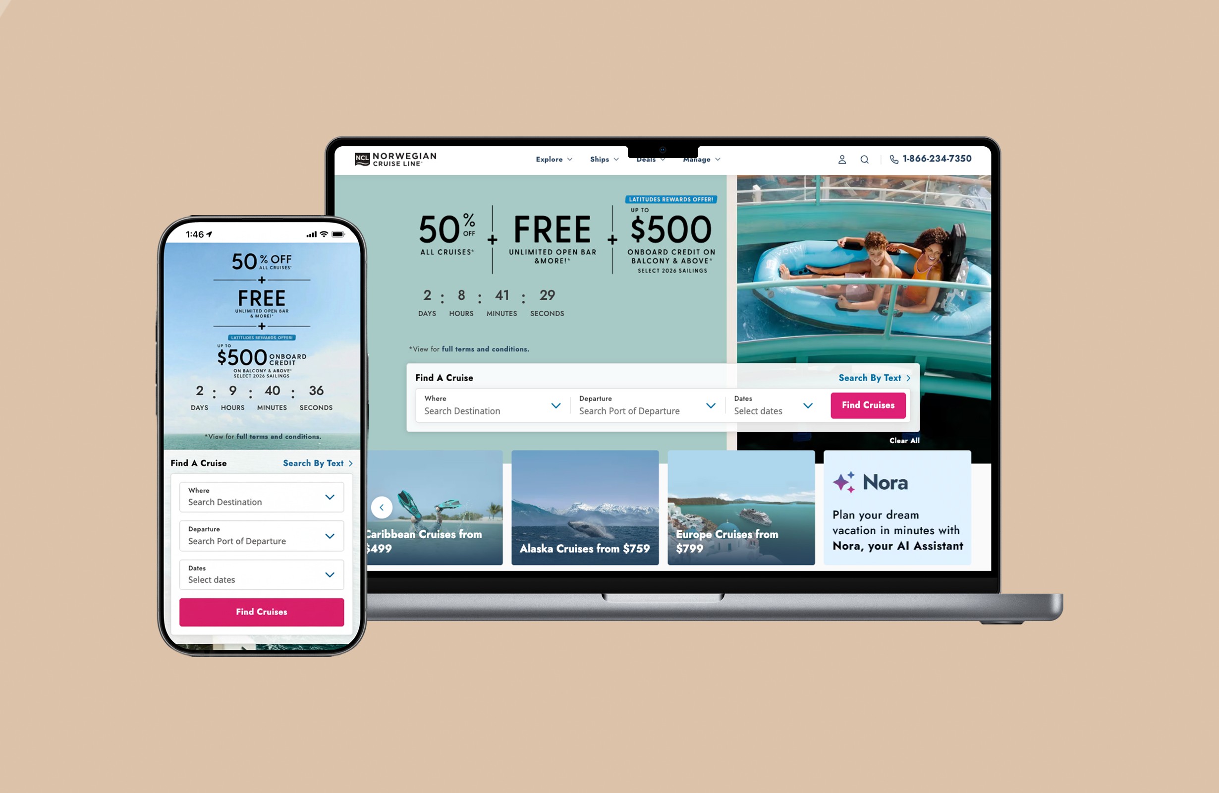
Designed the end-to-end checkout flow for NCL.com on purchases averaging $3,000– $5,000. Contributed to a 20% increase in completed bookings.